
Navy Blue & Burnished Gold
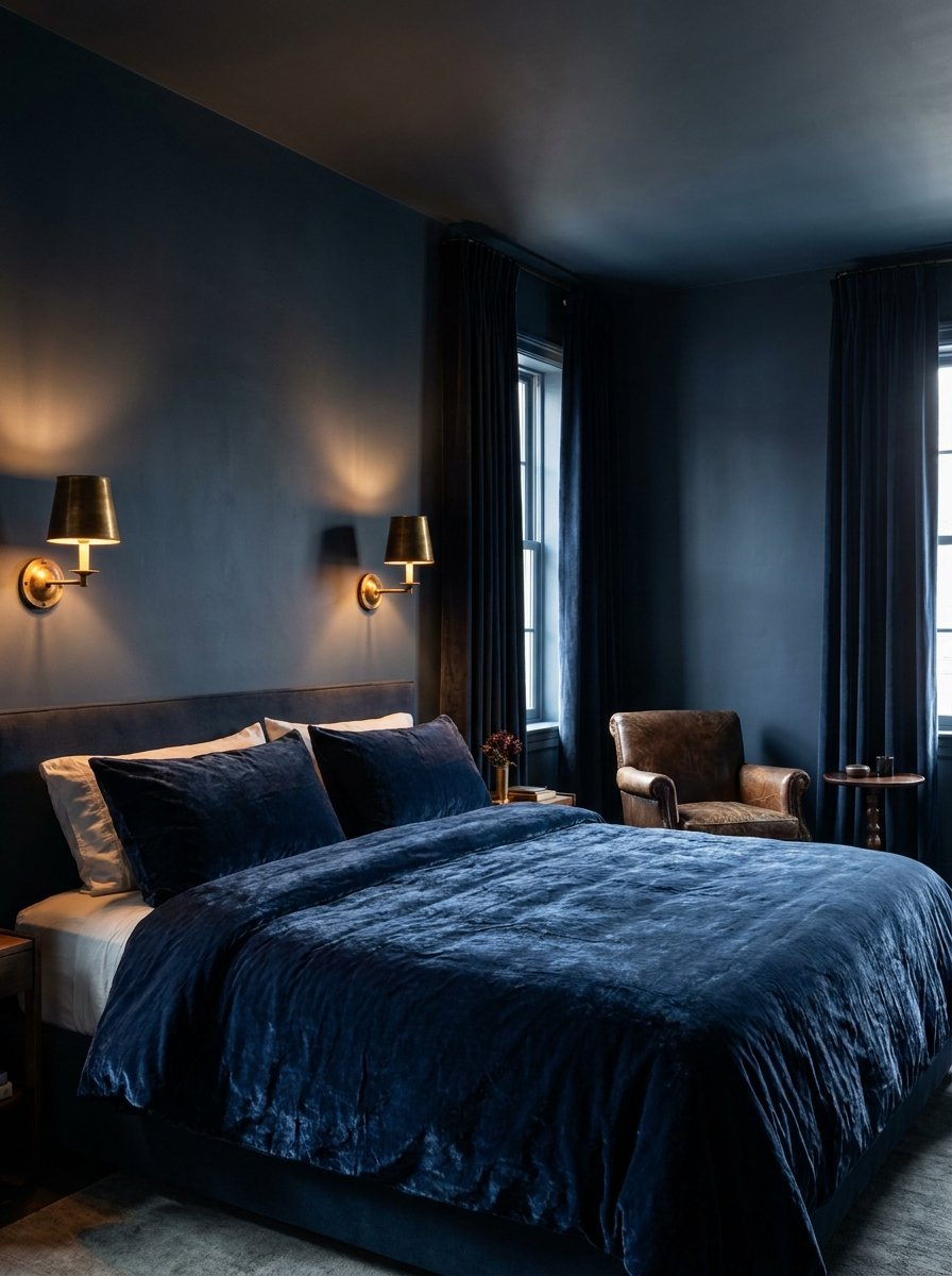
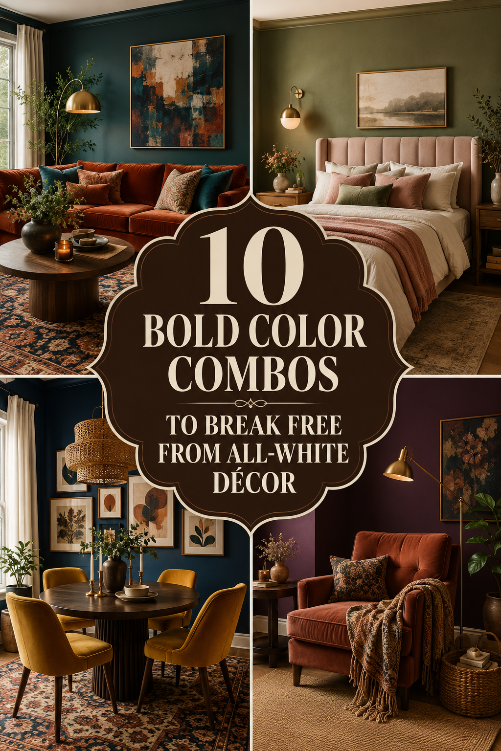
Navy blue serves as the ultimate ‘new neutral,’ providing a sense of security and depth that white simply cannot achieve. When paired with burnished gold accents—think metallic sconces, picture frames, or silk throw pillows—the result is an atmosphere of quiet luxury. This combination works exceptionally well in bedrooms because the cool tones of the navy promote rest, while the gold adds a necessary warmth that prevents the space from feeling cold. Focus on velvet textures for the navy elements to catch the light, creating a regal, nocturnal vibe that makes every night feel like a stay at a five-star hotel.
Terracotta & Sage Green
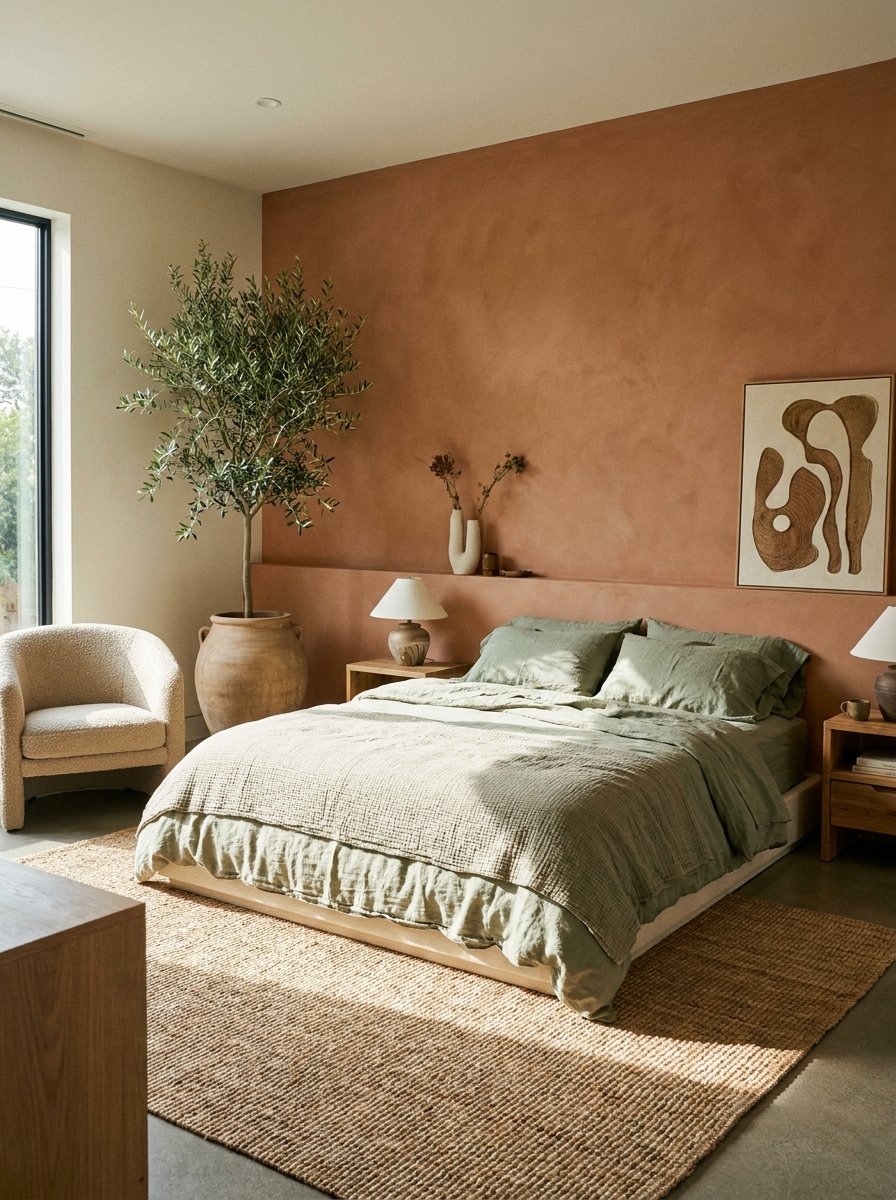
Bring the restorative power of the outdoors inside with a pairing of terracotta and sage green. This duo leans into the ‘Biophilic’ design trend, emphasizing organic connection. Terracotta provides a sun-baked warmth that grounds the room, while sage green offers a soft, botanical contrast that soothes the eyes. This palette is perfect for those who want color without the intensity of neon or primary shades. Incorporate linen bedding and clay pottery to enhance the tactile, earthy feel, creating a rustic yet refined sanctuary that feels like a Mediterranean villa tucked away from the modern world.
Mustard Yellow & Charcoal Gray
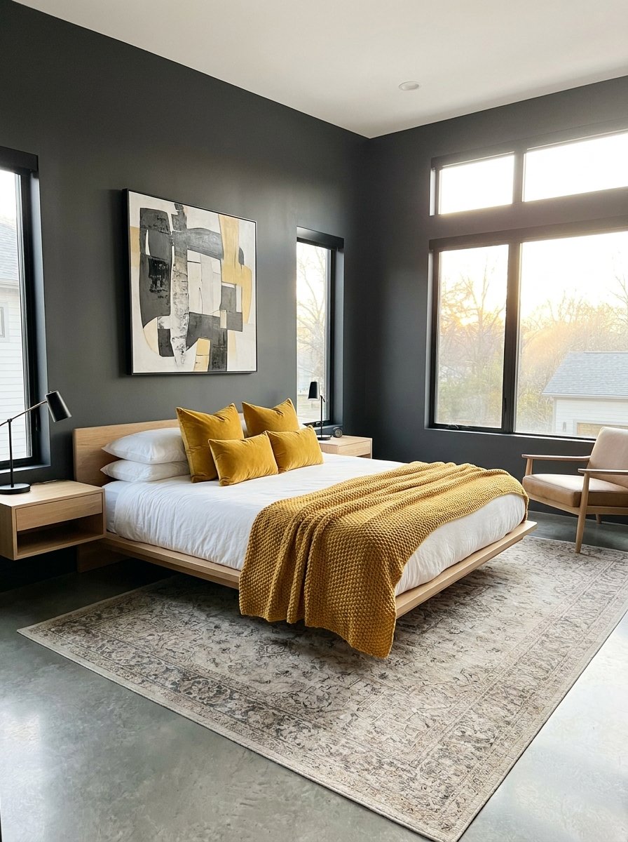
If you struggle with morning lethargy, a mustard yellow and charcoal gray combo is your design antidote. The charcoal provides a sophisticated, moody backdrop that allows the vibrancy of mustard yellow to pop without overwhelming the senses. This high-contrast pairing is inherently modern and energetic. Use charcoal for the larger surfaces, like the headboard or an accent wall, and save the mustard for accent pieces like a chunky knit throw or an upholstered bench. It’s a sophisticated way to inject sunshine into your routine while maintaining a grounded, masculine-leaning edge that feels incredibly intentional.
Emerald Green & Soft Blush
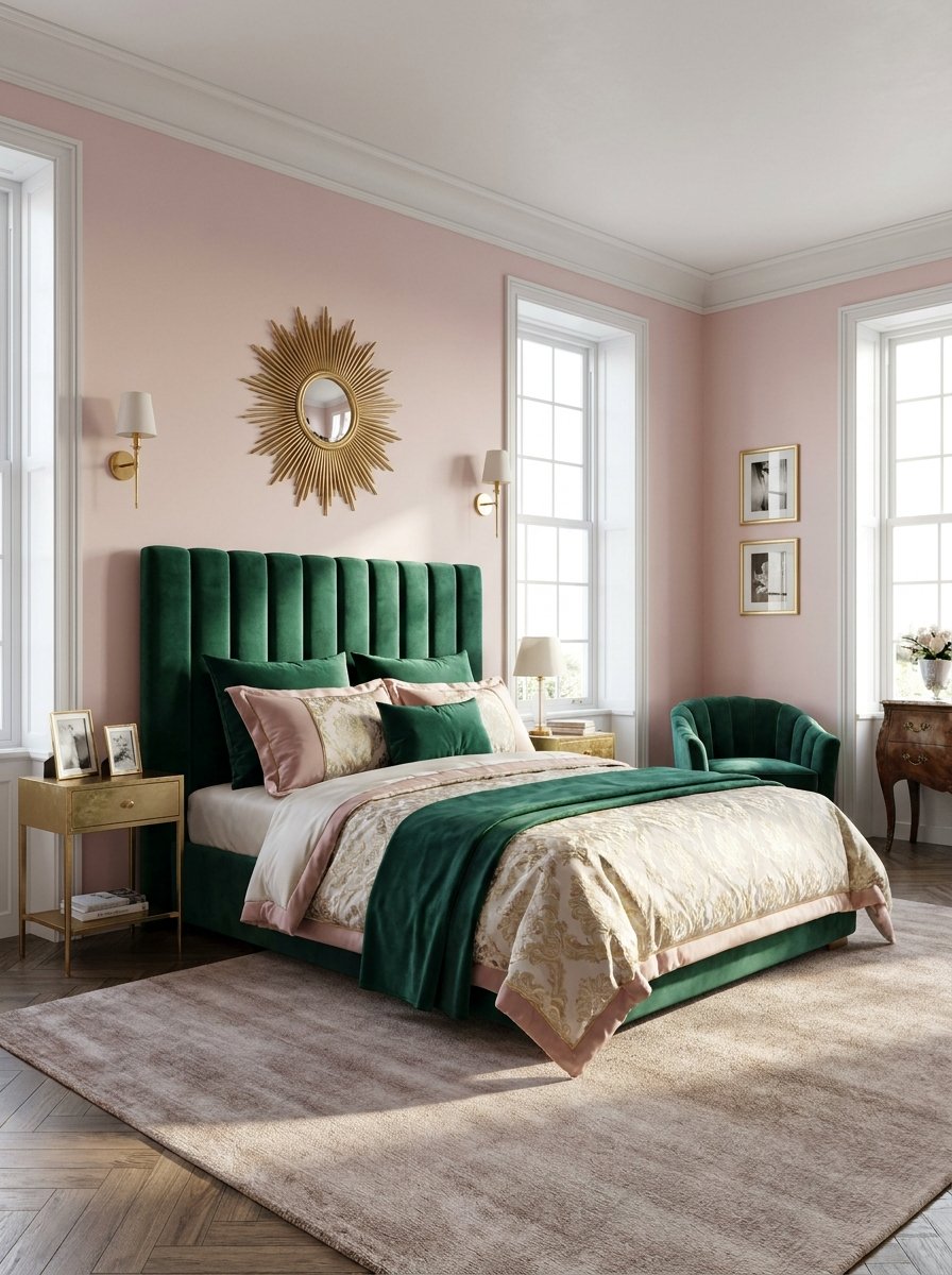
For a look that balances strength and softness, look no further than emerald green and blush pink. This combination is a masterclass in color theory, pairing a deep, saturating jewel tone with a delicate pastel. The emerald green brings a sense of lush, forest-like tranquility, while the blush pink softens the edges, adding a touch of romance and light. This pair is particularly effective in master suites, where you want to balance masculine and feminine energies. Try an emerald velvet headboard against a very soft blush wall for a look that is both timeless and trendy.
Deep Plum & Warm Ochre
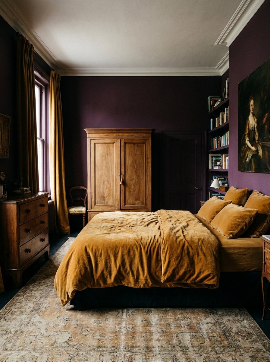
Step into the world of maximalism with the regal pairing of deep plum and warm ochre. This is a bold choice for those who crave a bedroom with a historical, almost academic feel. Plum is a heavy, intellectual color that suggests opulence, while ochre brings a spicy, golden-hour warmth that illuminates the purple tones. This combination thrives on texture; consider silk drapes in plum and a heavy ochre wool rug. It’s a daring departure from the sterile white aesthetic, creating a cocoon-like environment that feels incredibly cozy during the winter months and sophisticated year-round.
Teal & Burnt Orange
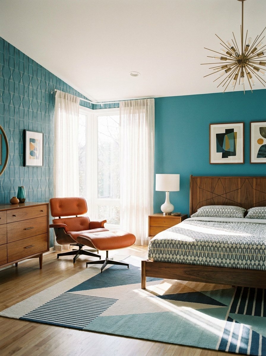
Taking inspiration from mid-century modern design, teal and burnt orange offer a vibrant, complementary contrast that feels both nostalgic and fresh. Teal is a versatile blue-green that offers more personality than navy, while burnt orange provides a fiery, grounded energy. To keep this look balanced, use teal as your primary color for walls or bedding and introduce burnt orange through art, rugs, or decorative ceramics. This pairing is excellent for creative individuals who want their bedroom to feel like an extension of their artistic personality rather than a standard showroom.
Lavender & Slate Blue
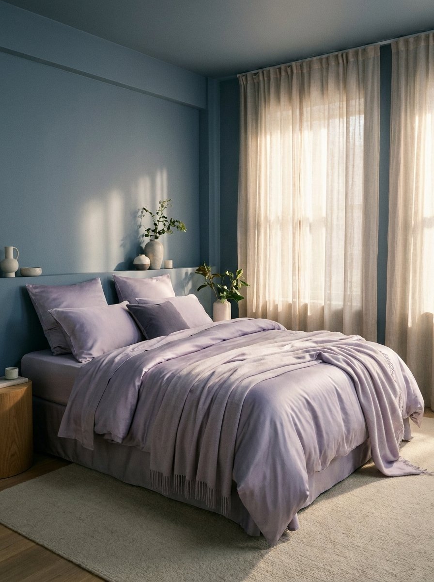
If you love the idea of color but fear it might be too ‘loud’ for sleep, lavender and slate blue are the perfect solution. This cool-toned pairing is the epitome of serenity. Unlike the starkness of white, these shades provide a soft ‘wash’ of color that mimics the sky at twilight. Slate blue offers a slightly industrial, grounded base, while lavender adds a touch of whimsical softness. This combination is scientifically proven to lower heart rates and promote relaxation, making it the ultimate palette for a high-stress professional looking for a peaceful escape.
Black & Forest Green
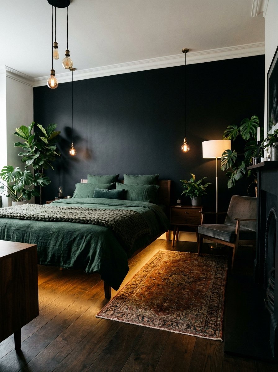
For the ultimate ‘dark academia’ or moody aesthetic, black and forest green create a space that feels like a private sanctuary hidden in the woods. While black might seem intimidating, when used as an accent or in matte finishes, it adds incredible depth and framing to a room. Forest green acts as the organic connector, preventing the black from feeling too harsh. This combo works best with natural wood elements and plenty of indoor plants. It’s a sophisticated, bold choice that proves you don’t need white to make a room feel spacious and expensive.
Rust & Midnight Blue
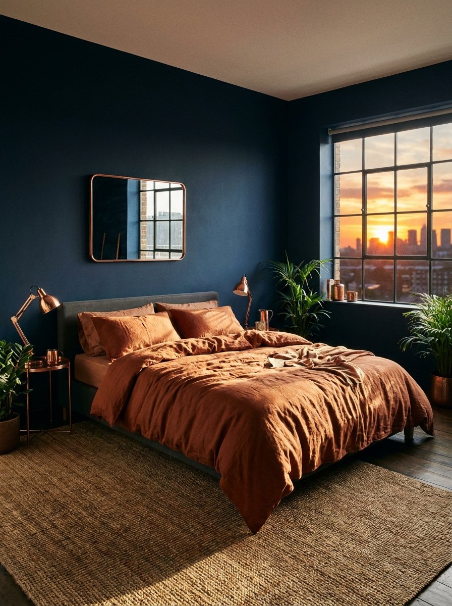
Rust and midnight blue offer a stunning celestial-meets-terrestrial vibe. Midnight blue provides a limitless sense of depth—perfect for ceilings or large rugs—while rust adds a tactile, heat-heavy contrast. This pairing is especially beautiful in rooms with lots of natural light, as the sun brings out the red undertones in the rust and the hidden gradients in the blue. It’s a mature, grounded palette that feels ‘lived-in’ and soulful. Use copper hardware to bridge the two colors, creating a cohesive look that is both striking and incredibly comfortable.
Coral & Mint
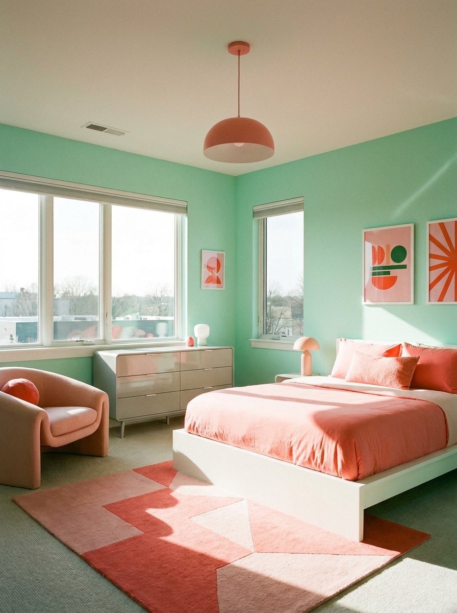
Break away from the ‘boring’ by embracing the playful, retro-revival energy of coral and mint. This combination is fresh, energetic, and unapologetically cheerful. Mint green provides a cool, minty-fresh base that keeps the room feeling airy, while coral adds a punchy, tropical warmth. This pairing is ideal for guest rooms or sun-drenched bedrooms where you want to evoke a sense of permanent vacation. To keep it sophisticated, use these colors in modern silhouettes—think a mint upholstered bed frame with coral geometric art—rather than traditional floral patterns.